Maestro

Maesiro

BURGER BAE

BURGER BAE

Burger Bae is a well-established burger chain based in Chandigarh, conceptualized as the “Stone Age of Flavors.” The brand vision centered on creating a distinctive food experience where bold, cartoon-inspired visuals coexist with a premium, contemporary aesthetic. From the outset, the founders aimed to build a brand that is highly recognizable, emotionally engaging, and visually sophisticated, while maintaining strong product credibility.

Despite a clear business vision, Burger Bae lacked a structured visual identity system to support its market presence. The absence of defined brand assets made it difficult to achieve consistency across customer touchpoints, limiting the brand’s ability to differentiate itself within a competitive quick-service restaurant landscape.

  • No established logo, color palette, or cohesive visual identity framework
  • Translating a cartoon-driven concept into a modern, premium brand language
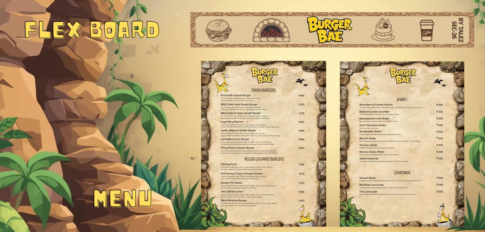
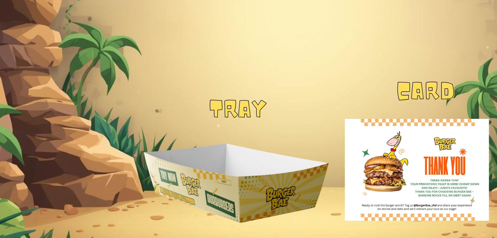
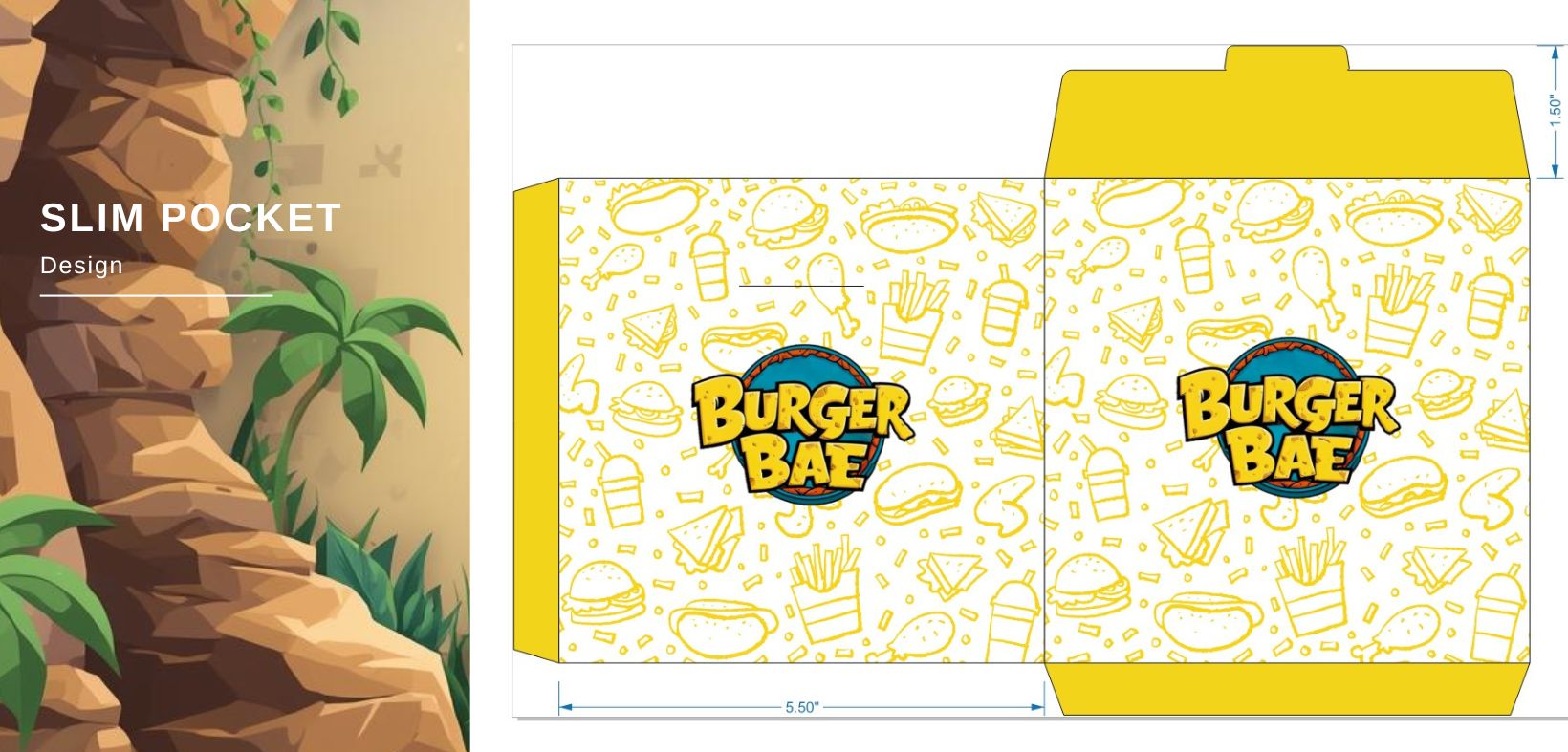
  • Designing and scaling multiple packaging formats while maintaining brand uniformity
  • Creating a consistent narrative across all physical and digital brand touchpoints

To solve these challenges, Burger Bae partnered with SocialWatch, and I led the brand identity and visual design strategy. My role involved developing a comprehensive brand system aligned with the “Stone Age of Flavors” concept (defining visual principles, color hierarchies, illustration styles, and pattern systems that could scale across applications).

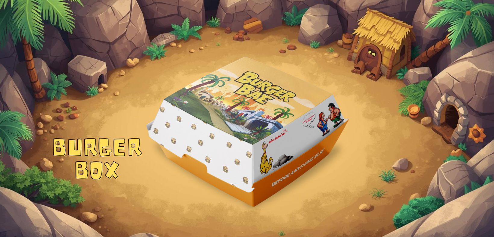
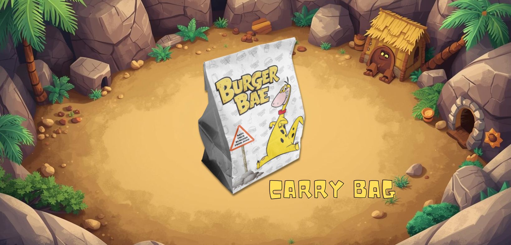
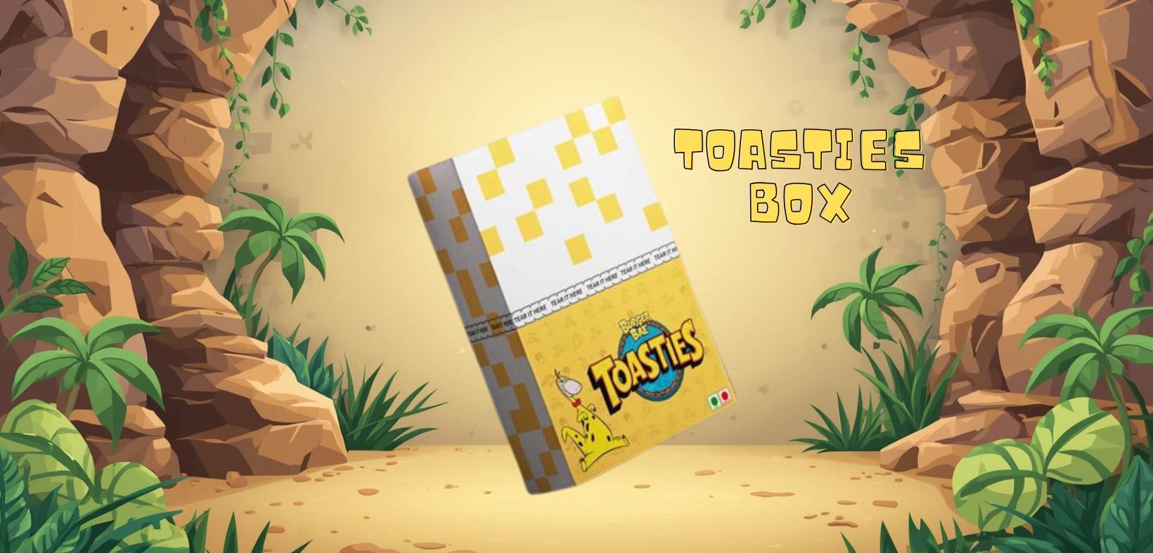
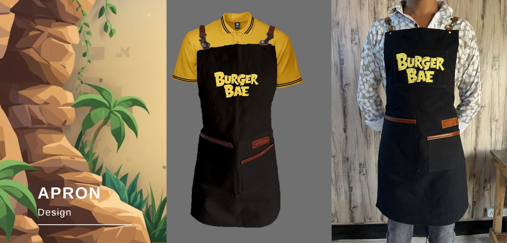
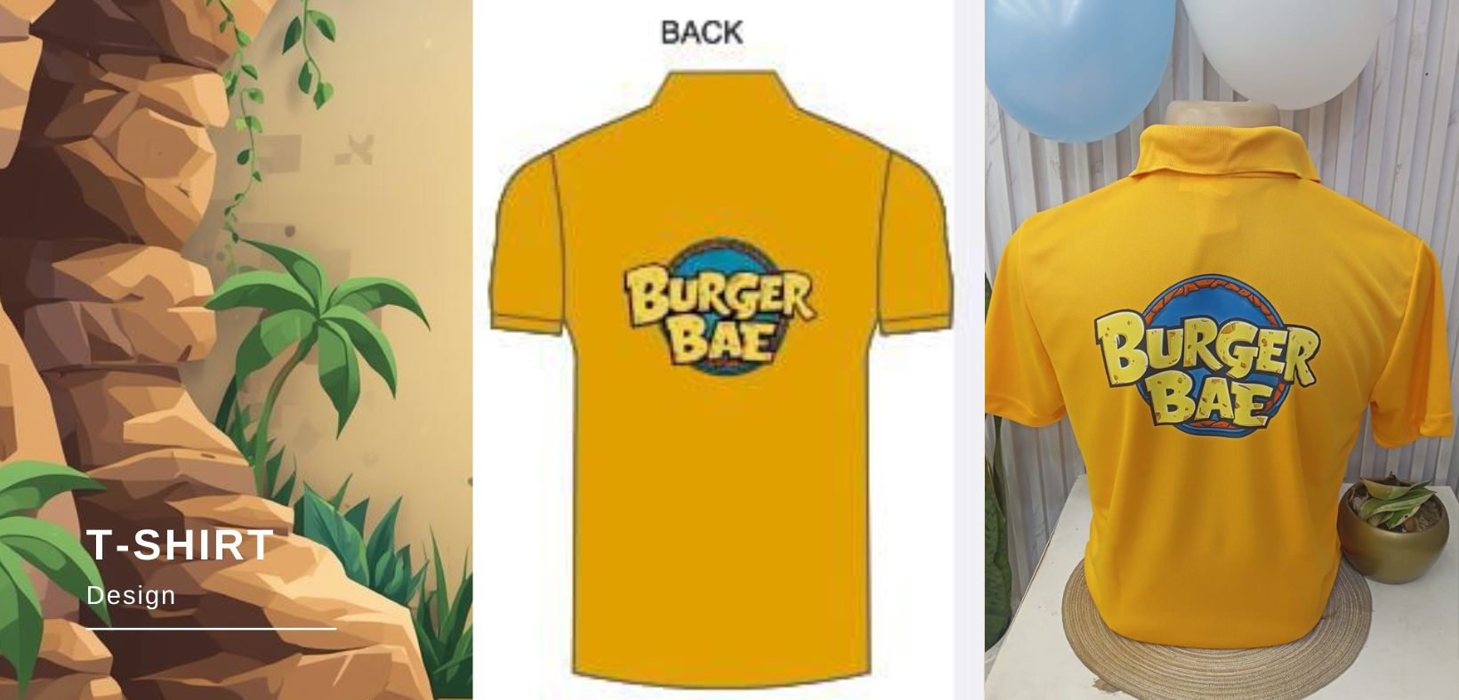
Each brand asset was designed within a unified visual framework, ensuring consistency, flexibility, and long-term usability. Packaging was treated as a core storytelling medium rather than a functional element alone, allowing every customer interaction to reinforce brand personality, visual coherence, and premium perception.

The outcome was a structured, scalable, and character-led brand identity that positioned Burger Bae as a distinctive and competitive player in its category.

Burger Bae’s visual identity is rooted in the idea of the “Stone Age of Flavors.” I translated this concept into a bold, illustrated world inspired by rocky landscapes, caves, textures, and primitive forms, reimagined through a playful, modern cartoon lens.

“The color palette is built around warm yellows, earthy browns, sandy neutrals, and broad accents, creating a balance between nostalgia and premium appeal. Repeating hand-drawn patterns, textures, and character elements ensure visual continuity across every brand touchpoint.”

Burger Box

The Burger Box serves as the core brand canvas. I used earthy tones and bold yellow accents against stone-inspired backgrounds to instantly establish the Stone Age theme. Playful illustrations and organic patterns bring character to the box while keeping it visually rich and premium.

Meal Box

For the Meal Box, I amplified the brand’s playful side. Bright, energetic colors paired with rocky landscapes and cartoon elements make the design engaging for kids while staying aligned with the overall Stone Age visual system. The patterns help unify all sides of the box into one cohesive story.

Carry Box

The Carry Bag extends the Stone Age world beyond the restaurant. Textured visuals, bold logo placement, and earthy color tones turn the bag into a strong branding element that feels both rugged and fun, reinforcing the “Stone Age of Flavors” concept on the move.

Toasties Box

In the Toasties Box, I focused on pattern-driven storytelling. Geometric, stone-inspired motifs combined with warm yellow tones give the packaging a premium yet playful look. Even in a compact format, the design remains visually consistent and instantly recognizable.

Coffee Cup

The Coffee Cup uses minimal illustration with controlled color contrasts. By placing the logo and Stone Age-inspired visuals against warm, earthy backgrounds, the cup feels stylish, modern, and rooted in the brand’s core identity without overpowering the design.

Flex Board & Menu

The Flex Board and Menu were designed as immersive brand storytelling pieces. Stone textures, cave-like frames, and illustrated icons establish the theme instantly, while warm colors and structured layouts ensure readability and visual impact from a distance.

Tray & Thank You Card

The Tray continues the patterned visual language using subtle textures and brand colors, ensuring consistency at the point of service. The Thank You Card adds a friendly, human touch with playful illustrations and warm tones that leave a lasting impression.

Apron Design

For the Apron, I kept the color palette strong and grounded. The contrast between dark tones and bold yellow branding ensures visibility while maintaining a professional look that still feels playful and on-theme.

T-Shirt Design

The T-shirt acts as wearable branding within the Stone Age universe. Bold colors and clean logo placement allow the identity to stand out while staying simple, confident, and instantly recognizable.

Slim Pocket Design

Even the smallest packaging reflects the larger visual system. I used repeating hand-drawn patterns inspired by food, tools, and primitive symbols, paired with the brand’s signature colors to maintain consistency down to the finest detail.